專業Google 關鍵字廣告文案寫作,專人Google廣告代操服務,展現出流量轉金流的最大化關鍵字廣告,台北Google廣告,台北Google代理商,關鍵字廣告, 台北 Google 關鍵字廣告,協助企業開通Google Ads帳戶在Google上做廣告。了解有關如何充分利用Google Ads的更多信息 台北基隆GOOGLE關鍵字廣告基隆台北網頁設計費用台北網頁設計價格基隆網頁設計費用
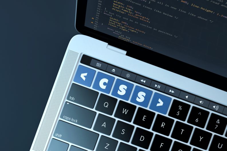
邊框通常被認為是次要的細節,用作圖像或容器元素的點睛之筆。它們是一種美感,但幾乎沒有什麼值得興奮的。但隨著 CSS 的發展,它們有潛力變得更強大。
考慮到這一點,讓我們來看看一些邊框範例,這些邊框透過 CSS 提供的最佳功能進一步增強。
搶風頭的人
這是一個提供平滑動畫邊框的解決方案。這種設定的好處在於它能吸引你,但絕不是俗氣或誇張的。這將成為一個出色的號召性用語按鈕。
CSS 範例
CSS
效果
CSS
效果
css代碼
- #box {
- display: flex;
- align-items: center;
- justify-content: center;
- width: 400px;
- height: 200px;
- color: white;
- font-family: 'Raleway';
- font-size: 2.5rem;
- }
- .gradient-border {
- --borderWidth: 3px;
- background: #1D1F20;
- position: relative;
- border-radius: var(--borderWidth);
- }
- .gradient-border:after {
- content: '';
- position: absolute;
- top: calc(-1 * var(--borderWidth));
- left: calc(-1 * var(--borderWidth));
- height: calc(100% + var(--borderWidth) * 2);
- width: calc(100% + var(--borderWidth) * 2);
- background: linear-gradient(60deg, #f79533, #f37055, #ef4e7b, #a166ab, #5073b8, #1098ad, #07b39b, #6fba82);
- border-radius: calc(2 * var(--borderWidth));
- z-index: -1;
- animation: animatedgradient 3s ease alternate infinite;
- background-size: 300% 300%;
- }
- @keyframes animatedgradient {
- 0% {
- background-position: 0% 50%;
- }
- 50% {
- background-position: 100% 50%;
- }
- 100% {
- background-position: 0% 50%;
- }
- }
html代碼
- <div class="gradient-border" id="box">CSS 範例 <br />CSS<br />效果</div>


